
Doubts about the commitment of top executives to content marketing are fading. The largest technology companies are investing in their competency in this area. Curata reports that 92% of marketers belong to organizations that view content as a business asset.
So, it is time to talk about one of the challenges that come with providing audiences with information — lots of it. Speaking at TED, journalist and designer David Mccandless touched on a common suffering for people around the world, one borne from information overload or data glut.
McCandless proposed what might be an easy solution, and that is “using our eyes more”. Through visualization, humans have something akin to an information map. Simple diagrams prove useful in making patterns and connections seen. They guide consumers to information that is important to them via a digestible, not to mention pretty cool, format.
What if you apply that idea to your content marketing strategy? Then things can get more interesting from there.
Show, don’t tell
In his TED talk, McCandless cited the work of Tor Norretranders, a Danish physicist who converted the bandwidth of the senses into computer terms. In other words, Norretranders visualized what marketers have come accustomed to hearing: sight is the fastest among the senses.
With the same bandwidth as a computer network, the sense of sight indeed beats the rest. In second place, touch has the same speed as a USB key. Having the throughput of a hard disk, hearing and smelling tied at third. Taste is last, as it can process things as quickly as a pocket calculator would.
But the more interesting thing is that humans are aware of .7% of everything mentioned. It is just amazing to think of how much a set of eyes are dealing with unconsciously. Does that not sound compelling enough for you to let your customers use their eyes more?
A tale of two languages
The language of the mind uses words, numbers, and concepts. While the language of the eye involves colors, shapes, and patterns. The marriage of the two languages results in a beautiful thing: data visualization. And data visualization is about putting pieces of information together so that the final output makes sense to your target readers. In another version, you are telling a story through data.
Instead of just watching consumers get lost in the barrage of messages, you help them find their bearing. You want them to make better choices, decisions. At the same time, you want them to understand how your brand can meet their needs, desires, and expectations.
Exhibit A: Infographics
Infographics are a common visual content type among marketers. They are also easier and faster to make, except when they involve larger and complex datasets, but such cases are rare. Infographics often compress a guide or a process, simplify the presentation of history and other timelines, and highlight statistics that matter to a certain type of audience.
For instance, young pop music fans may find a comparison of the Instagram statistics of the world’s top pop stars interesting. An infographic can collect the numbers in one place, and inserting photos of the likes of Selena Gomez, Taylor Swift, and Miley Cyrus can boost clicks, comments, and shares.
See this packed list of infographic ideas which you can use to help customers see the world in a beautiful way.
Exhibit B: Charts, diagrams, and maps
When your content marketing staff know how to read and manipulate data, making charts and maps won’t be a problem. These visual content formats often fall under the static data visualization category. But they can also be interactive (more on that later). They are all about adding context to pieces of information that do not tell much on their own. They are also helpful in illustrating scale.
This diagram from The Washington Post, which shows how far an airplane’s deep-sea signal can be detected by comparing its depth to the height of buildings, is a good example. It was published in the wake of the disappearance of a Malaysian airliner.
Exhibit C: Interactive charts, diagrams, and maps
Numbers, particularly huge numbers, can be tough to digest. And in some people, they just lose their meaning. There are also hard subjects to follow, such as politics and wars. It is far easier to confuse who is fighting for, with, and against whom. Relationships among the players of the Syrian war are pretty complicated. But media publication Slate proves that explaining it in layman’s terms takes some imagination, and knowledge in interactive data visualization.
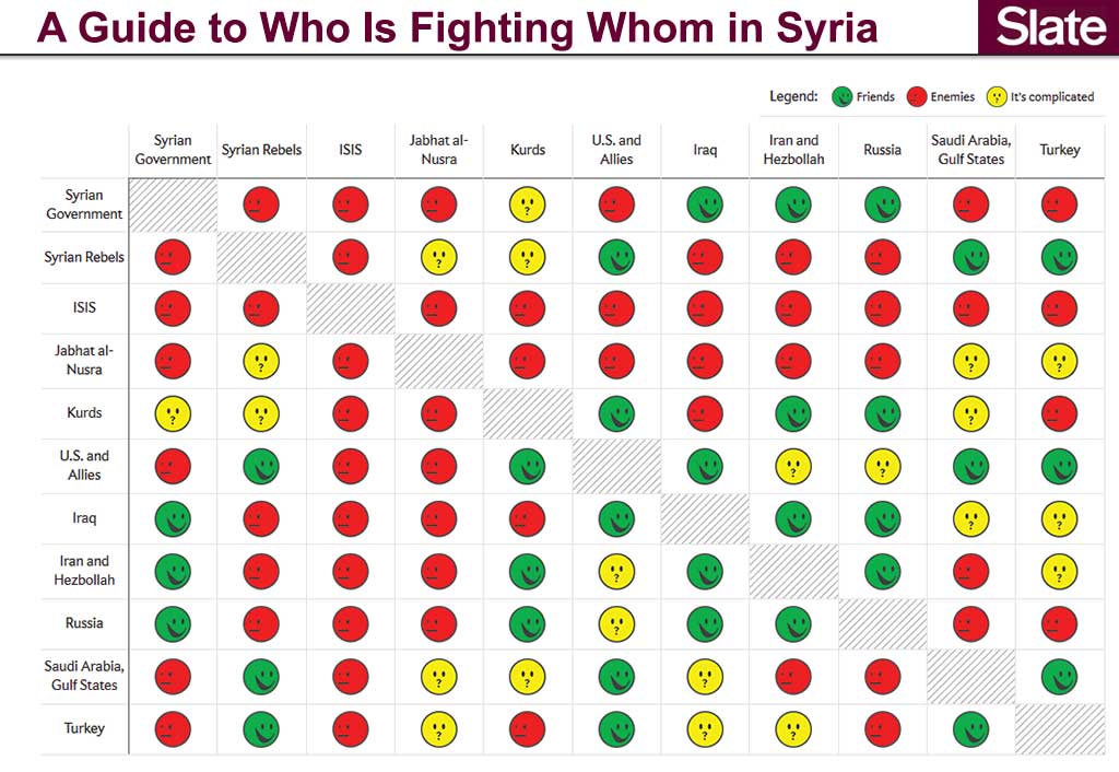
At its simplest, an interactive chart, diagram, or map allows the audience to interact with the visual content. In this example, they can click on the faces to read further about the relationships between two groups.
Add CEOWORLD magazine to your Google News feed.
Follow CEOWORLD magazine headlines on: Google News, LinkedIn, Twitter, and Facebook.
This report/news/ranking/statistics has been prepared only for general guidance on matters of interest and does not constitute professional advice. You should not act upon the information contained in this publication without obtaining specific professional advice. No representation or warranty (express or implied) is given as to the accuracy or completeness of the information contained in this publication, and, to the extent permitted by law, CEOWORLD magazine does not accept or assume any liability, responsibility or duty of care for any consequences of you or anyone else acting, or refraining to act, in reliance on the information contained in this publication or for any decision based on it.
Copyright 2024 The CEOWORLD magazine. All rights reserved. This material (and any extract from it) must not be copied, redistributed or placed on any website, without CEOWORLD magazine' prior written consent. For media queries, please contact: info@ceoworld.biz
SUBSCRIBE NEWSLETTER