
In a world of data, being able to crunch numbers for charts and reports is not enough. Every good analyst needs to produce a credible data story – it’s the narrative around the data that leaves a lasting impression.
Humans are hardwired to crave stories. Story drive – the yearning to hear and make stories – is an inborn that precedents our language development. Anthony de Mello has said “The shortest distance between truth and a human being is a story.” Stories have unparalleled power to inform, inspire and persuade us.
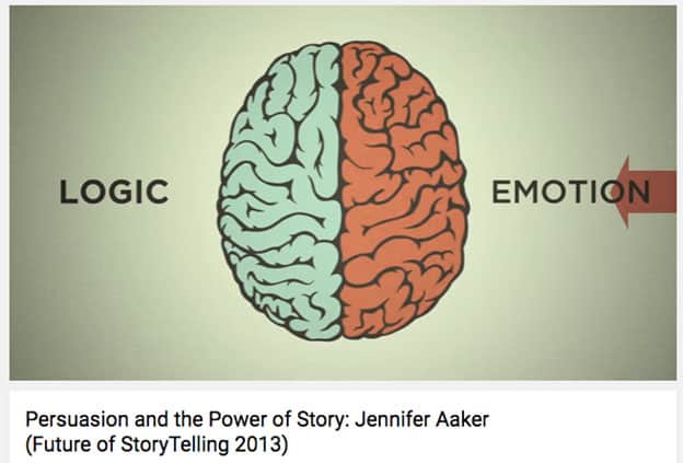
If traditional storytelling aims at our heart, data stories engage both the heart and brain. In addition to a compelling narrative, data stories appeals to our reasoning by using numerical information, such as in data journalism. In below video by Stanford Professor Jennifer L. Aaker, she explain the power of visual data stories lies in their ability to engage both our emotions and intellect.
But adding data to our stories can be a double edged sword: when the audience is presented with large sets of data, they seek the information the confirmed inbuilt biases, as dataviz expert Alberto Cairo has pointed out in his book “The Truthful Art”.We must be very careful and truthful in selecting the right visualization model to not just tell the story audience wants to hear, but the whole story that does not leave out important truth.
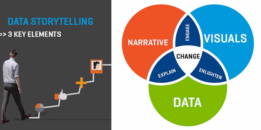
Now that we have selected data in its truthful form, what makes a good data story? Modern data visualization founding father Edward Tufte has said a good data visualization is “complex ideas communicated with clarity, precision and efficiency”. In today’s consumer culture context, the increasing consumption of data stories by a general audience also means we need to do a good job at educating a mass audience and paint them a picture for the future. In short, a good visual data story possess below characteristics:
- It makes sense of complex issues
- It reveals a startling surprise
- It gives directions for the future
- It inspires informed actions
As tech companies scale, they harvest a myriad of user data that can be sliced and diced for meaningful data stories. Here we are going to take a look at what leading tech giants are doing with their user data, and how they are crafting great stories we can borrow from.
OkTrends (OkCupid)
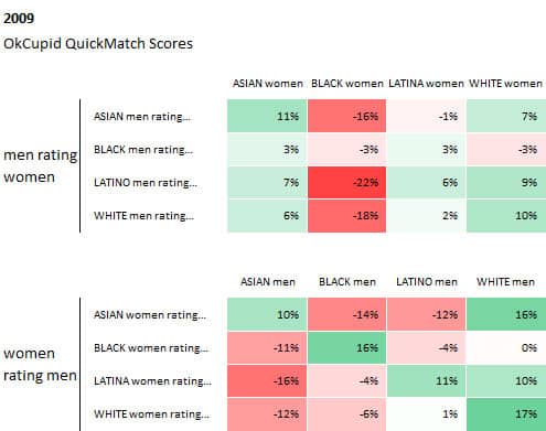
Ok Cupid is a pioneer in telling stories about dating trends and biases using internal data. Take one of their most debated and quoted story “Race and Attraction” for instance, the title itself is provocative enough. Looking at QuickMatch scores by race and gender, they come to meaningful and shocking conclusions role of race in snap attraction judgements.
What they did well here is to organize data in a way that leads to meaningful conclusions by displaying it in color coded tables. The values in these tables are “preference vs. the average”. So the top right left the cell value means Asian men consider Asian women 11% above average attractive, while immediately to its right we can see Asian men rate Black women as 16% below average attractive.
Color helps us make sense of data by rule of grouping. Readers can quickly group similar data points by the same color and come to meaningful conclusions, such as that we can quickly tell that Latina women find both Latino and white male attractive. Gradation helps us determine the difference in numerical value, such as a deeper red is perceived to be more negative than light shade of red. In this case, we don’t need to remember the exact numbers to tell that in general, White female find Asian male less attractive than Black male.
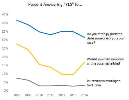
Another example of how OkCupid tells story with data is by revealing the surprise in their data trends with simple visualization. Line graph is a simple visualization technique, but surprisingly effective if there is a clear linear trend in your data. In the graph below, you can see that contrary to what we believe, OkCupid users are growing to be more conservation over time on key racial issues. If there is surprise element in your data, group and visualize it in a way that supports your narrative rather than contradicting it.
Spotify Insights
Spotify has huge amounts of listening data – when do people listen, what people are listening to, and how frequent are songs being played etc.
In this story about the most distinctive fourth of July music across 50 states, Spotify looked into what songs people listened to the most on fourth of July in each state, and visualized the finding in below color coded map. As a result of this data mining, Spotify also came up with this playlist of all the top songs for this special occasion.
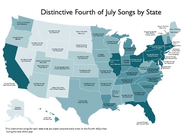
A good visualization should be able to stand on its own without much contextual explanation. When faced with large, complex geographical datasets, choropleth map is a great graphic form to tell stories in a clear, memorable manner. Using shading to highlight the frequency of songs played in each state, it becomes very clear to us “which state is the most patriotic”. This map is able to condense very complex geographical, qualitative, and frequency data in a clear and memorable manner.
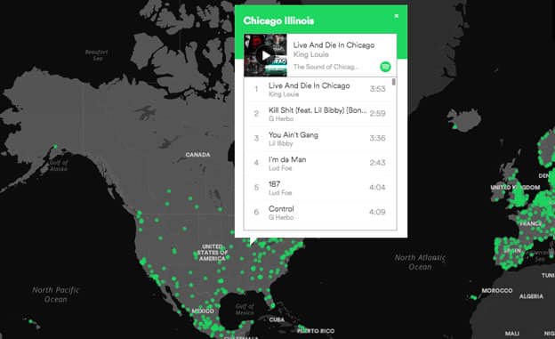
Apart from telling stories with conclusive insights like the one above, maps can also be a great way to tell exploratory data stories. In the interactive map below, Spotify visualized music data across the world by cities in interactive form. Readers can navigate the world map, and click on any city and see the most “distinctive songs” of the city. Instead of displaying close-ended conclusions, this kind of visual data story invites visitors to explore the data and decide meaningful takeaways on their own.
Job Trends by Indeed
Indeed harvests a wealth of job posting data including job title, industry, geographical and seasonal demands, etc. At Job Trends, Indeed uses various visual storytelling techniques to shed insights on job related data, such as line charts, bubble maps,
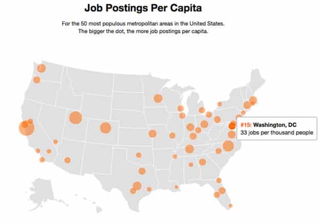
When telling data stories with bubble maps, it is very important to use normalized data to make sure the size of bubbles are proportionate to their relational value to the groups we are comparing them to. In this “job posting per capita” map below, job posting per capita is calculated to compare values of varying populations across 50 states.
Apart from color, another visual element that helps us make sense of complex data here is the size of bubbles. The bigger bubbles represent higher jobs per capita value, which gives us a clear overview on which states have the highest job opportunities for a specific role.
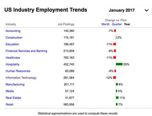
In data storytelling, the danger is to get carried away by the desire to show everything at once, and leaving readers at a loss for what to focus on. The key to telling a focused data story is to choose the right visual format that clearly indicates what you are measuring. In below chart, is it very clear to us that the important measure here is change in job posting over time per industry.
If the author here didn’t display the “change vs prior” percentage change and simply showcase job postings, we won’t come to any meaningful conclusions for this data set. The simple visualization technique of using stacked bar graph to represent how big is the percentage combined with color codes tells a clear, effective story.
Fitbit Blog
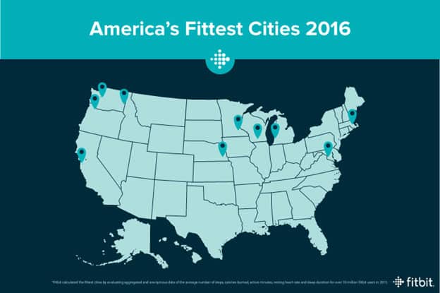
Fitbit does a good job at revealing the surprise in their data. With a myriad of user generated fitness data such as exercise time, steps taken and resting time, Fitbit is able to and look at both macro trends across large geographical areas, and zoom in on a single state to find out what people are doing.
In this post about which state is America’s fittest, Fitbit took account of a number of factors and aggregated the big data for insights. And the answer will challenge your conventional belief: it’s Madison in Wisconsin, not yoga capital Santa Monica or vegan heaven Portland.
As a fitness product, the ultimate goal is to help people to stay active and healthy. While self-monitor your fitness data might keep you on track of your own goals, what’s more motivational is to see how you stack up against your peers.
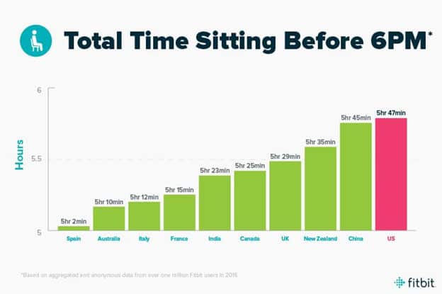
Fitbit does a great job at benchmarking their massive amount of user data by cohorts, and tell compelling data stories to inspire action. In this post that urges people to reduce sitting time and move around more often, Fitbit looks at aggregated total sitting time by country, and convinced us just how badly sedentary the 9-5 workers are, and how much we need to move around more.
The call to action to set Reminders to Move in Fitbit Alta is both beneficial to product engagement and user’s personal health – a true win win. At its best, data storytelling should serve the purpose of common good and inspire informed decisions.
Zillow Porchlight
The Zillow blog has a mission to be “always on” and “guide you home”, and does this by offering data-backed insights to help people navigate complex markets and make buying/renting decisions.
In the “Market Trends” section of the Zillow blog Porchlight, readers can find a myriad of useful market data visualized for easy interpretation. Created for home buyers and renter, these data stories explore topics very close to consumers heart, such as this post about where millennials can afford to buy homes, given today’s (somewhat discouraging) economic climate.
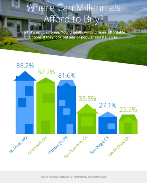
What this visual does great is to keep its audience (millennials) in mind, and appeals to them by using pictorial bar graphs to make it interesting. A younger audience can be deterred by hard market data, and this visualization does a great job at being friendly to its young audience.
Also, using heights to represent the value of data, it is very clear to us that St. Louis and Cincinnati offer a much higher chance of owning homes than San Francisco and San Diego by a significant margin. The power of visual storytelling can turn impersonal numbers into easily relatable facts.
Another way companies can tell great stories with data is to use data to guide actions for the future, such as what Zillow research team did in this post that attempts to rank top US cities for romantic prospects.

The research team decided on a few key ranking factors such as percentage of singles, disposable income and number of entertainment options per capita. The result might be amusing or surprising to some, but it shed some light (hopefully) for those who are in the mood for love on Valentine’s Day.
Your Turn
Does your company harvest a large amount of user data? Is there anyway you can mine these data to reveal startling truths or inspire actions? Share your thoughts with us below.
If you are ready to take the leap of faith in visualizing your data, Visme is a free to get started on data storytelling.
Add CEOWORLD magazine to your Google News feed.
Follow CEOWORLD magazine headlines on: Google News, LinkedIn, Twitter, and Facebook.
This report/news/ranking/statistics has been prepared only for general guidance on matters of interest and does not constitute professional advice. You should not act upon the information contained in this publication without obtaining specific professional advice. No representation or warranty (express or implied) is given as to the accuracy or completeness of the information contained in this publication, and, to the extent permitted by law, CEOWORLD magazine does not accept or assume any liability, responsibility or duty of care for any consequences of you or anyone else acting, or refraining to act, in reliance on the information contained in this publication or for any decision based on it.
Copyright 2024 The CEOWORLD magazine. All rights reserved. This material (and any extract from it) must not be copied, redistributed or placed on any website, without CEOWORLD magazine' prior written consent. For media queries, please contact: info@ceoworld.biz
SUBSCRIBE NEWSLETTER