Marvel has caught the eye of the mainstream public in recent years thanks to the billion-dollars superhero movies. The brand and its logo have a 77-year-old history and a few changes until they both became so recognizable.
The Marvel brand is now almost constantly visible and invests a generous budget in marketing initiatives and its brand extensions. If details would define a brand, then this one is Marvel. Today we will discuss this brand’s logo and what led it to become one of the most powerful logos worldwide. By looking into the Marvel logo evolution we aim to inspire you to see beyond this case study and see what your visuals need to be friendly, recognizable and easy to remember.
The Power of Rebranding: In the Beginning There Wasn’t a Marvel
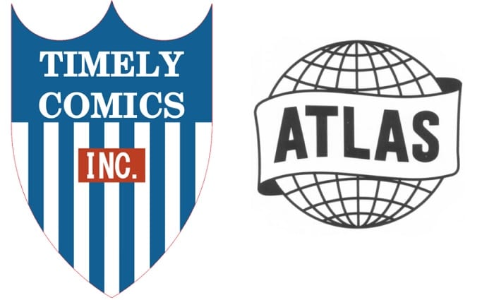
The brand and logo were founded in 1939 by Martin Goodman. It was a small and underground comic book company which launched as Timely Comics. Back then, it was the Golden Age of Comics. The Timely logo consisted of a white-and-blue coat of arms with a tiny red rectangle with the word INC. Books began to appear and the logo remained visible for 11 years.
Marvel had its first rebranding in 1950 and earned a simplified name – Atlas. To emphasize it the logo consisted of a globe surrounded by a sash. Brand reps must have aimed for awareness and they found an obvious way to reach it. The logo explained the company’s name.
The First Marvel Logo Screamed Awareness
The first Marvel Comics logo was unveiled in 1957 as a final overall rebranding. The following changes only adjusted the company name and simplified the logo. However, the first logo resembled a stamp. It was a black circle on a red background and had the brand in white. It also included a golden wheat leaf. Before thinking that this logo was too complicated compared with its most recent version, remember that this happened 6 years ago.
However, Marvel is not famous for adding the same logotype to all its products and movies. The brand now has logos for all its characters. Superhero enthusiasts notice any slight change immediately, even if the logo background just changes or the logo minimizes a bit. Marvel’s attention to details began years ago. Some noticed that between 1961 and 1963 comic books occasionally featured only the word MC placed vertically. Also, other books only had the MARVEL Comics Group written in black. This happened between 1963 and 1967.
![]()
Why Logo Adjustments are Sometimes Necessary
Marvel had two other versions of its logo before it reached the one we know today. Why did that happen? Time passed, so the logo had to be appealing to the widest public. This wouldn’t have been possible with the below versions. Meanwhile, Marvel continues to experiment with different logos on specific comic books.
- 1967 – 1987: This logo had the word MARVEL written in an orange comic-book font. The word was surrounded by the head of a few characters. These were Thor, Captain America, Black Widow, Iron Man and The Thing. Although other characters were not included in the logo, the brand decided to show its leading heroes.
- 1987 – 2002: Do you remember the old MTV logo? Then, you might find this version familiar. It had a large and red stylized M and the world MARVEL in its upper side. In the M’s center there was the world Comics in a yellow and funky font.
What Today’s MARVEL Logo Can Teach You
The first version of today’s Marvel logo appeared in 2002. Since then, it was slightly adjusted to become more harmonious and make the letters smoother. It was a plain white writing on a red background.
The most recent adjustment to the Marvel logo was in 2016 when the company acknowledged its fame and became Marvel Studios. The logo had an announced release at the Comic-Con and included new fanfare. Music was composed by Michael Giacchino, who also worked on The Incredibles, Star Trek and TV series Lost. These marketing initiatives carry some branding lessons we could all use:
- If you didn’t launch your brand and don’t have a logo yet, you might consider making it as simple as possible. Simple also means versatile, easy to remember and appealing. You can create your own logo and make it look professional. Just remember not to add to many elements.
- When the mainstream audience begins to appreciate you, it’s time to take it into consideration and adjust some of your message, tone of voice and visuals. However, keep consistency.
- Brand extensions don’t need to interfere with your brand. By connecting your side products to your main brand, service or product, you help them be familiar to those who discover them.
- Consider circumstances. By the time the Marvel Studios logo was released, the company was already purchased by Disney. The transaction took place and was announced in 2009. MARVEL explored the superhero movie possibility to the fullest. Black Panther is one of its most recent films. The movie earned over $80 million worldwide.
The Marvel story is in writing and it clearly is in a positive tone. The brand already extended and reached a peak by becoming one of the most recognizable in the world. It DC rivalry is notorious and still in play. However, the brand works on details, products, movies, marketing campaigns and collectibles for its core public in the meantime. Learn from this visual branding story and consider having a logo that is prone to become famous!
Add CEOWORLD magazine to your Google News feed.
Follow CEOWORLD magazine headlines on: Google News, LinkedIn, Twitter, and Facebook.
This report/news/ranking/statistics has been prepared only for general guidance on matters of interest and does not constitute professional advice. You should not act upon the information contained in this publication without obtaining specific professional advice. No representation or warranty (express or implied) is given as to the accuracy or completeness of the information contained in this publication, and, to the extent permitted by law, CEOWORLD magazine does not accept or assume any liability, responsibility or duty of care for any consequences of you or anyone else acting, or refraining to act, in reliance on the information contained in this publication or for any decision based on it.
Copyright 2024 The CEOWORLD magazine. All rights reserved. This material (and any extract from it) must not be copied, redistributed or placed on any website, without CEOWORLD magazine' prior written consent. For media queries, please contact: info@ceoworld.biz
SUBSCRIBE NEWSLETTER